Weights:
400500600700
License:OFL / Apache 2.0
CSS
font-family: 'Poppins', sans-serif;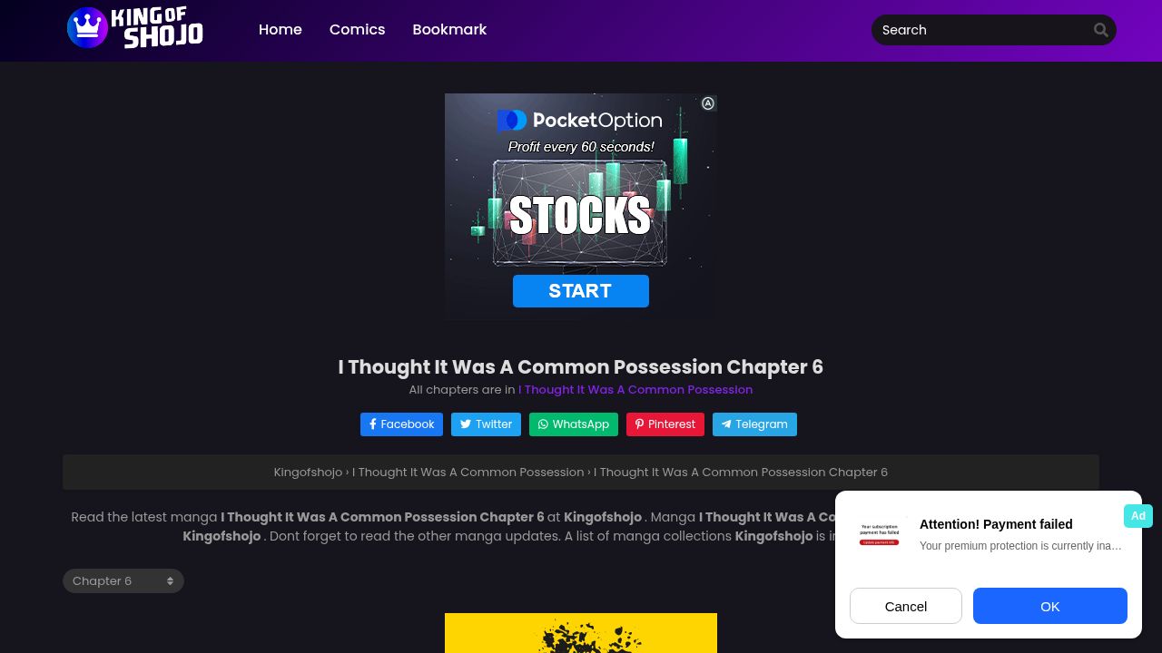

kingofshojo.com
path: /i-thought-it-was-a-common-possession-chapter-6
I Thought It Was A Common Possession Chapter 6 | Kingofshojo
cached · 3h ago
Kingofshojo.com uses Poppins, Fira Sans, Font Awesome 5 Brands and Font Awesome 5 Free as its main typefaces. Tahoma is declared as a fallback. 5 fonts detected, last checked Nov 1, 2026.
At kingofshojo.com, the typography reflects the vibrant and engaging nature of its manga content. The site primarily uses Poppins for its modern appeal, alongside Fira Sans for readability in various weights, ensuring that text is both attractive and legible. Font Awesome 5 Brands and Font Awesome 5 Free add playful icons that enhance the visual experience, while Tahoma provides a reliable fallback for system compatibility. This thoughtful font selection caters to a diverse audience passionate about shojo manga.
font-family: 'Poppins', sans-serif;Sphinx of black quartz, judge my vow.
The quick brown fox jumps over the lazy dog. 0123456789
font-family: 'Font Awesome 5 Brands', sans-serif;font-family: 'Tahoma', sans-serif;Sphinx of black quartz, judge my vow.
The quick brown fox jumps over the lazy dog. 0123456789
font-family: 'Font Awesome 5 Free', sans-serif;Sphinx of black quartz, judge my vow.
The quick brown fox jumps over the lazy dog. 0123456789
font-family: 'Fira Sans', sans-serif;The cascading font order declared in CSS. Browsers try each font left-to-right until one is available.
Kingofshojo.com uses Poppins, Fira Sans, Font Awesome 5 Brands and Font Awesome 5 Free as its main typefaces. Tahoma is declared as a fallback. 5 fonts detected, last checked Nov 1, 2026.
Kingofshojo.com primarily uses Poppins, Fira Sans, Tahoma, and Font Awesome 5 for its typography, creating an engaging reading experience.
You can find Poppins and Fira Sans on Google Fonts, while Font Awesome 5 is available through the Font Awesome website for web projects.
Fira Sans is known for its legibility and versatility in various weights, making it an excellent choice compared to other sans-serif fonts like Arial or Helvetica.
Kingofshojo.com utilizes multiple weights of Poppins, specifically 400, 500, 600, and 700, allowing for a dynamic typographic hierarchy.
Explore typography choices on similar pages.
Other sites that share font choices with Kingofshojo.com.


