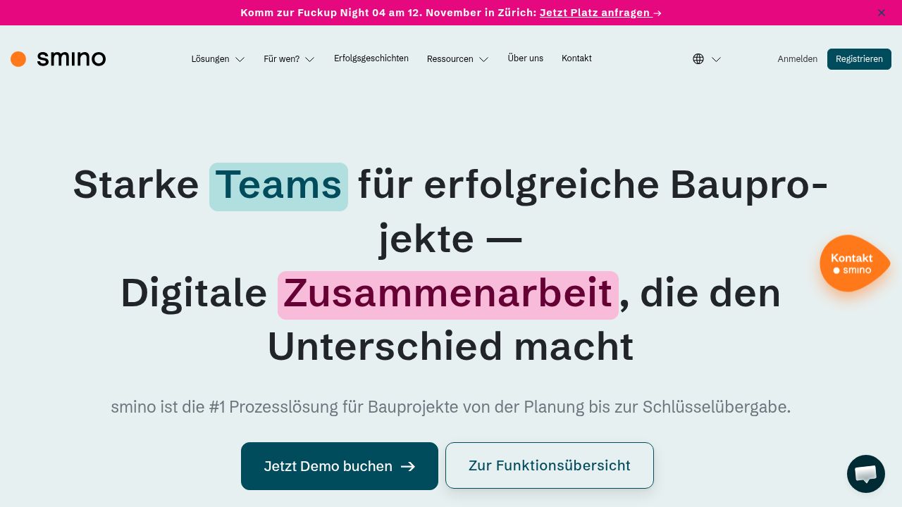
smino.com serves the construction industry by connecting project owners, authorities, planners, and contractors. Their choice of fonts like Schibsted Grotesk and Poppins reflects a focus on clarity and functionality. The use of system fonts like Tahoma alongside custom fonts ensures readability across devices. They also incorporate Font Awesome for iconography, enhancing user experience with recognizable symbols. This thoughtful typography supports their mission of creating an efficient collaboration platform.
Frequently asked questions about Smino.com's fonts
What fonts does Smino.com use?
Smino.com uses Schibsted Grotesk, Poppins, Font Awesome 5 Free, Manrope and Hack Regular as its main typefaces. Tahoma is declared as a fallback. 15 fonts detected, last checked Oct 29, 2026.
What primary fonts are used on smino.com?
smino.com primarily uses Schibsted Grotesk, Poppins, Tahoma, and several custom fonts like Manrope and Hack Regular, ensuring diverse typographic expression.
Where can I find the fonts used on smino.com?
You can find Schibsted Grotesk and Roboto on Google Fonts. Custom fonts like Poppins and Font Awesome are available through their respective repositories or websites.
How do the fonts on smino.com compare to alternatives?
Fonts like Schibsted Grotesk and Poppins offer a unique character compared to standard sans-serif typefaces, providing more personality while maintaining readability.
What weights are available for the fonts on smino.com?
smino.com utilizes various font weights: Schibsted Grotesk has 400 and 700, Poppins is available in 400, while Font Awesome 5 Free offers a bold 900 weight.
Are there fallback fonts used on smino.com?
smino.com does not specify fallback fonts. However, their primary choice of Google Fonts and system fonts like Tahoma ensures a reliable display across different devices.