Weights:
400
License:OFL / Apache 2.0
CSS
font-family: 'Inter', sans-serif;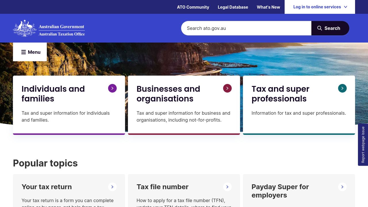
ato.gov.au
Home | Australian Taxation Office
The ATO is the Government’s principal revenue collection agency. Our role is to manage and shape the tax, excise and superannuation systems that fund services for Australians.
cached · 1h ago
Ato.gov.au uses Inter and Poppins as its main typefaces. helvetica-neue, Arial and Helvetica are declared as fallbacks. 5 fonts detected, last checked Oct 8, 2026.
The Australian Taxation Office (ato.gov.au) employs a carefully curated selection of fonts to communicate its role in managing tax and revenue collection for Australians. The primary fonts, Inter and Poppins, suggest clarity and accessibility, crucial for engaging a diverse audience. Inter, with its versatile 400 weight, pairs well with the bolder 600 weight of Poppins, while Helvetica Neue serves as a reliable fallback, ensuring that the ATO's visual identity remains consistent across various platforms.
font-family: 'Inter', sans-serif;font-family: 'Poppins', sans-serif;Sphinx of black quartz, judge my vow.
The quick brown fox jumps over the lazy dog. 0123456789
font-family: 'helvetica-neue', sans-serif;These fonts are listed in the CSS as backups. The browser only falls back to them if the main fonts above fail to load.
The cascading font order declared in CSS. Browsers try each font left-to-right until one is available.
Ato.gov.au uses Inter and Poppins as its main typefaces. helvetica-neue, Arial and Helvetica are declared as fallbacks. 5 fonts detected, last checked Oct 8, 2026.
The primary fonts used on ato.gov.au are Inter (weight 400) and Poppins (weight 600). Additionally, Helvetica Neue (weight 400) is included as a fallback option.
You can find Inter and Poppins available for download on Google Fonts. Helvetica Neue may require a licensing purchase from font foundries.
Inter is designed for legibility in user interfaces, while Poppins offers a more geometric style. Together, they create a balanced visual hierarchy on ato.gov.au.
Inter has a weight of 400 available on ato.gov.au. Poppins is used in a bolder 600 weight, enhancing important text elements and headings.
Explore typography choices on similar pages.
Other sites that share font choices with Ato.gov.au.


