字重:
400
许可证:OFL / Apache 2.0
CSS
font-family: 'Inter', sans-serif;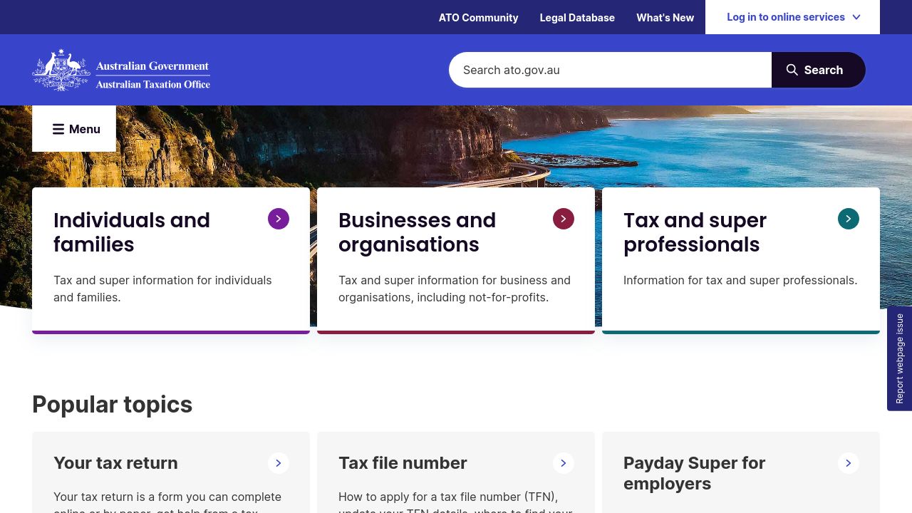
ato.gov.au
Home | Australian Taxation Office
The ATO is the Government’s principal revenue collection agency. Our role is to manage and shape the tax, excise and superannuation systems that fund services for Australians.
cached · 1d ago
Ato.gov.au使用Inter和Poppins作为主要字体。 helvetica-neue, Arial和Helvetica被声明为后备字体。 检测到 5 种字体,上次检查: 2026年10月8日。
澳大利亚税务局(ato.gov.au)在其数字平台上使用了多种字体,以增强其信息传递的清晰度和可读性。主要字体包括Inter和Poppins,分别以400和600的字重展现了简洁与现代的视觉效果。此外,Helvetica Neue作为辅助字体,进一步提升了整体的视觉一致性。这些字体选择不仅反映了税务局的权威性,也为用户提供了友好的在线体验。
font-family: 'Inter', sans-serif;font-family: 'Poppins', sans-serif;Sphinx of black quartz, judge my vow.
The quick brown fox jumps over the lazy dog. 0123456789
font-family: 'helvetica-neue', sans-serif;CSS中声明的级联字体顺序。浏览器从左到右尝试每个字体,直到找到可用的。
Ato.gov.au使用Inter和Poppins作为主要字体。 helvetica-neue, Arial和Helvetica被声明为后备字体。 检测到 5 种字体,上次检查: 2026年10月8日。
ato.gov.au主要使用Inter(字重400)和Poppins(字重600)作为自定义字体。此外,还使用Helvetica Neue(字重400)作为辅助字体。
Inter和Poppins可以在Google Fonts上找到,您可以免费使用它们。Helvetica Neue通常在Adobe Fonts和Apple设备上可用。
Inter和Poppins与Arial和Helvetica相比,提供了更好的可读性和现代感,适合数字平台使用。Helvetica Neue则为传统设计提供了优雅的替代选择。
Inter拥有多个字重,而ato.gov.au使用的是字重400。Poppins以字重600为主,Helvetica Neue则使用字重400。这种选择确保了文本的可读性和视觉层次。
探索类似页面的排版选择。
与Ato.gov.au共享字体选择的其他网站。


