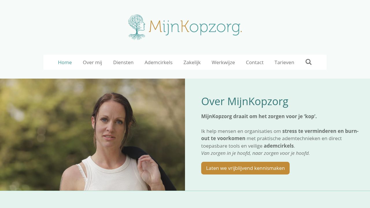
At mijnkopzorg.nl, the focus on breathwork and emotional balance is mirrored in their thoughtful typography choices. The primary use of Open Sans, with its versatile weights of 400 and 700, promotes clarity and accessibility, essential for guiding clients through their wellness journey. Complemented by system fonts like Arial and Times, along with the unique website-rendering font, the site creates a welcoming atmosphere. The inclusion of playful Comic Sans MS adds a touch of lightness, appealing to a diverse audience seeking connection and relaxation.
Frequently asked questions about Mijnkopzorg.nl's fonts
What fonts does Mijnkopzorg.nl use?
Mijnkopzorg.nl uses Open Sans and website-rendering as its main typefaces. Arial, Helvetica, Times and Comic Sans MS are declared as fallbacks. 7 fonts detected, last checked Nov 3, 2026.
What fonts are used on mijnkopzorg.nl?
The primary fonts used on mijnkopzorg.nl are Open Sans, Arial, Helvetica, Times, and Comic Sans MS, along with a custom website-rendering font.
Where can I get the fonts used on mijnkopzorg.nl?
You can obtain Open Sans from Google Fonts. Arial and Times are standard system fonts available on most computers, while Helvetica and Comic Sans MS are typically pre-installed on many devices.
How does Open Sans compare to other fonts on the site?
Open Sans, with its various weights, offers a modern look that enhances readability, especially compared to traditional fonts like Times. It is more approachable and friendly.
What styles and weights of Open Sans are used on mijnkopzorg.nl?
mijnkopzorg.nl utilizes Open Sans in weights 400 (regular) and 700 (bold), along with italic styles, providing flexibility in text presentation.
Are there fallback fonts if the primary fonts are unavailable?
Yes, if the primary fonts cannot be loaded, Calibri serves as the fallback font to ensure text remains legible and visually coherent.