Weights:
400500600700
License:OFL / Apache 2.0
CSS
font-family: 'Inter', sans-serif;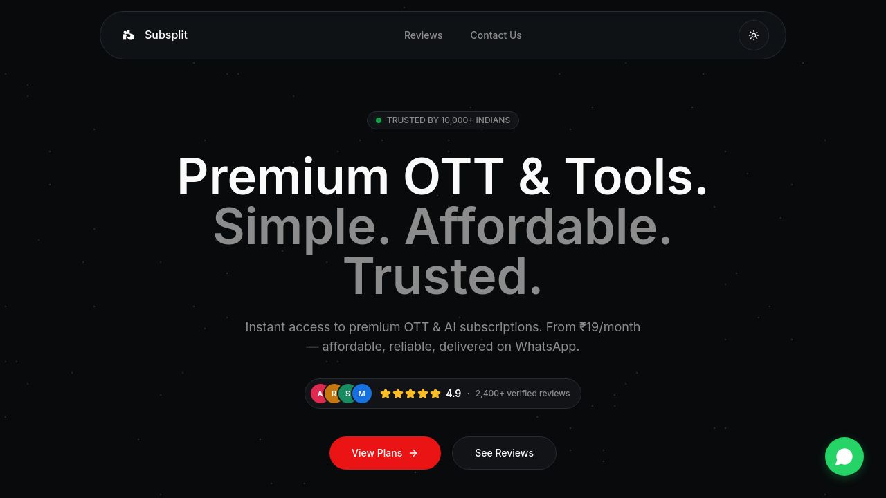

subsplit.in
Subsplit – Premium OTT & Tool Subscriptions
Discover premium OTT and digital tool subscriptions at affordable prices. Secure, instant access with full transparency on Subsplit.
cached · 16h ago
Subsplit.in uses Inter as its main typeface. Arial, Roboto, helvetica-neue and Segoe UI are declared as fallbacks. 14 fonts detected, last checked Oct 20, 2026.
Subsplit.in caters to users seeking premium OTT and tool subscriptions, and its choice of Inter font reflects a commitment to clarity and accessibility. The varying weights of Inter, from 400 to 700, contribute to a dynamic visual hierarchy that enhances user experience. This deliberate typographic choice, combined with a fallback stack including Arial and Roboto, ensures that the site remains versatile across different devices, appealing to a tech-savvy audience looking for reliable digital solutions.
font-family: 'Inter', sans-serif;These fonts are listed in the CSS as backups. The browser only falls back to them if the main fonts above fail to load.
The cascading font order declared in CSS. Browsers try each font left-to-right until one is available.
Subsplit.in uses Inter as its main typeface. Arial, Roboto, helvetica-neue and Segoe UI are declared as fallbacks. 14 fonts detected, last checked Oct 20, 2026.
Subsplit.in primarily uses the Inter font family in weights 400, 500, 600, and 700, ensuring a clear and engaging user experience.
You can download the Inter font from Google Fonts, where it's available for free, allowing you to use it in your own projects.
Inter offers a more contemporary design compared to Arial and provides better legibility at smaller sizes compared to Roboto, making it ideal for digital interfaces.
Inter is available in multiple weights, from 400 to 700, allowing for a range of typographic expressions that can enhance the readability and aesthetics of your content.
Explore typography choices on similar pages.


